Home /
Expert Answers /
Statistics and Probability /
the-graph-of-the-waiting-time-in-seconds-at-a-red-light-is-shown-below-on-the-left-with-its-mean-pa319
(Solved): The graph of the waiting time (in seconds) at a red light is shown below on the left with its mean ...
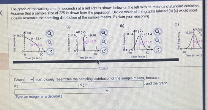
The graph of the waiting time (in seconds) at a red light is shown below on the left with its mean and standard deviation. Assume that a sample size of 225 is drawn from the population. Decide which of the graphs labeled (a) \( (c) \) would most closely resemble the sampling distribution of the sample means. Explain your reasoning. Graph most closely resembles the samplina distribution of the sample means, because \( \mu_{x}=\int \) \( \sigma_{\bar{x}}= \) and the graph (Type an integer or a decimal.)