Home /
Expert Answers /
Algebra /
the-graph-below-shows-the-national-average-thc-potency-levels-in-hash-oil-samples-from-1995-to-2015-pa169
(Solved): The graph below shows the national average THC potency levels in hash oil samples from 1995 to 2015 ...
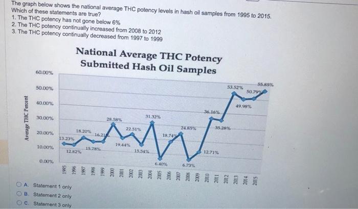
The graph below shows the national average THC potency levels in hash oil samples from 1995 to 2015. Which of these statements are true? 1. The THC potency has not gone below \( 6 \% \) 2. The THC potency continually increased from 2008 to 2012 3. The THC potency continually decreased from 1997 to 1999 B. Statement 2 only C. Statement 3 only
Expert Answer
The given graph shows the national average THC potency levels in hash oil samples from 1995 to 2015. We want to choose which of the given statements a