Home /
Expert Answers /
Economics /
the-following-graph-shows-a-decrease-in-aggregate-demand-in-a-hypothetical-country-specifically-a-pa440
(Solved): The following graph shows a decrease in aggregate demand in a hypothetical country. Specifically, a ...
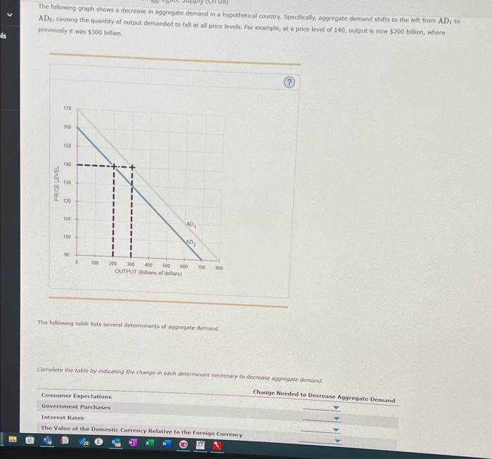
The following graph shows a decrease in aggregate demand in a hypothetical country. Specifically, aggregate demand shifts to the left. from AD \( \mathrm{AD}_{2} \), carsing the quantity of output demanded to fall-at all price levels. For example, at a price level of 140 , output is now \( \$ 200 \) billion, where. proviously it was \( \$ 300 \) bullion. The following table lists several determinants of agoregate demand. Complece the table by indicating the change in each determinant necesary to decrease aggrepate demand.
Expert Answer
Answer: Change Needed to Decrease Aggreg