Home /
Expert Answers /
Economics /
the-following-graph-plots-the-supply-and-demand-curves-in-the-market-for-polaroid-cameras-pa279
(Solved): The following graph plots the supply and demand curves in the market for polaroid cameras. ...
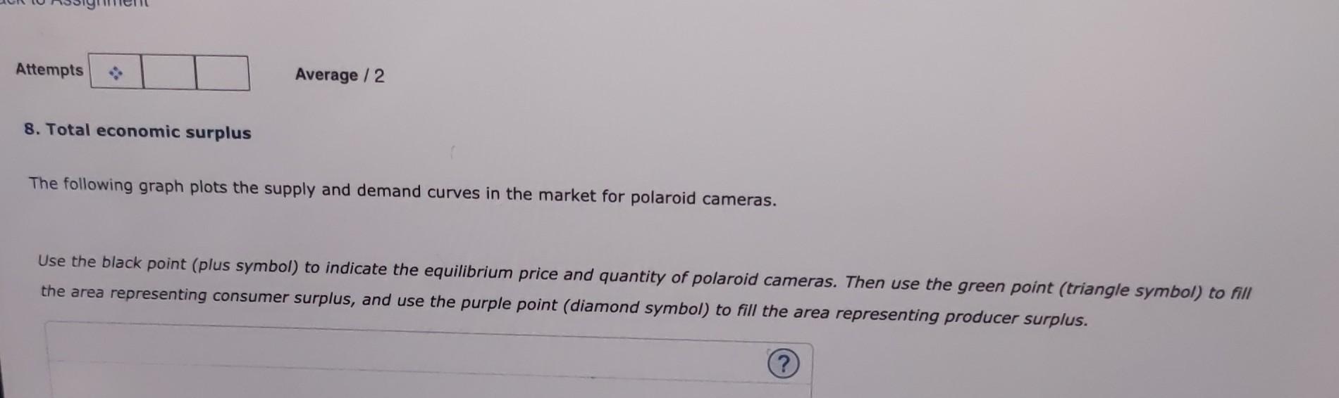
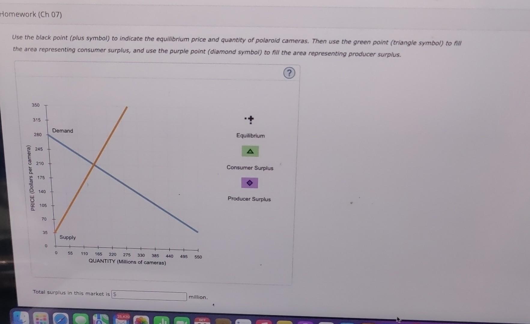
The following graph plots the supply and demand curves in the market for polaroid cameras. Use the black point (plus symbol) to indicate the equilibrium price and quantity of polaroid cameras. Then use the green point (triangle symbol) to fill the area representing consumer surplus, and use the purple point (diamond symbol) to fill the area representing producer surplus.
Use the black point (plus symbol) to indicate the equilibrium price and quantity of polaroid cameras. Then use the green point (triangle symbol) to fill the area representing consumer surplus, and use the purple point (diamond symbol) to fill the area representing producer surplus. Total surplus in this market is million.