Home /
Expert Answers /
Economics /
the-following-graph-lllustrates-the-market-for-almonds-it-plots-the-monthly-supply-of-almonds-and-pa891
(Solved): The following graph lllustrates the market for almonds. It plots the monthly supply of almonds and ...


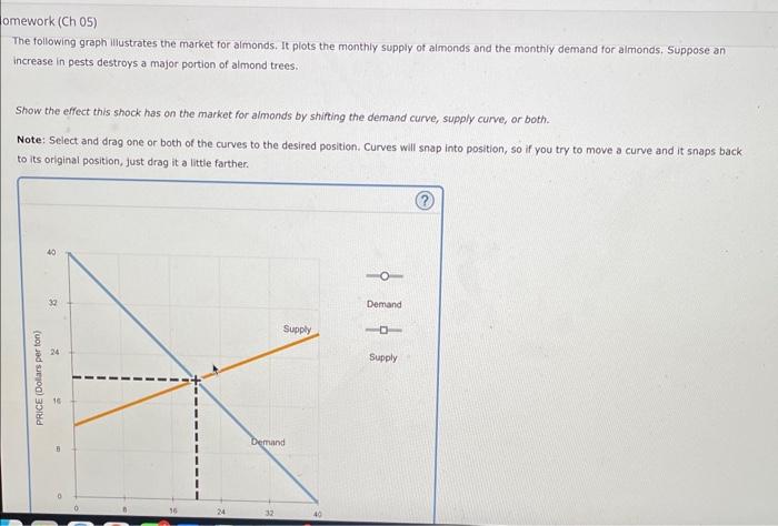
The following graph lllustrates the market for almonds. It plots the monthly supply of almonds and the monthly demand for aimonds. Suppose an increase in pests destroys a major portion of almond treesi. Show the effect this shock has on the market for aimonds by shirting the demand curve, supply curve, or both. Note: Select and drag one or both of the curves to the desired position. Curves will snap into position, so if you try to move a curve and it snaps back to its original position, just drag it a little farther.
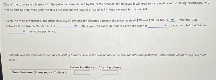
One of the growers is pleased with the price increase caused by the pests because she believes it will lead to increased revenue. Using elasticities, you will be able to determine whether this price change will lead to a rise or fall in total revenue in this market. Using the midpoint method, the price elasticity of demand for aimonds between the price levels of and per ton is between these two points, demand is . Thus, you can conclude that the grower's claim is , because total revenue will due to the pestilence. Confirm your previous conclusion by caldulating total revenue in the almond market before and after the pestilence. Enter these values in the following table.