Home /
Expert Answers /
Economics /
the-following-graph-illustrates-the-weekly-demand-curve-for-motorized-scooters-in-roanoke-use-the-pa707
(Solved): The following graph illustrates the weekly demand curve for motorized scooters in Roanoke. Use the ...
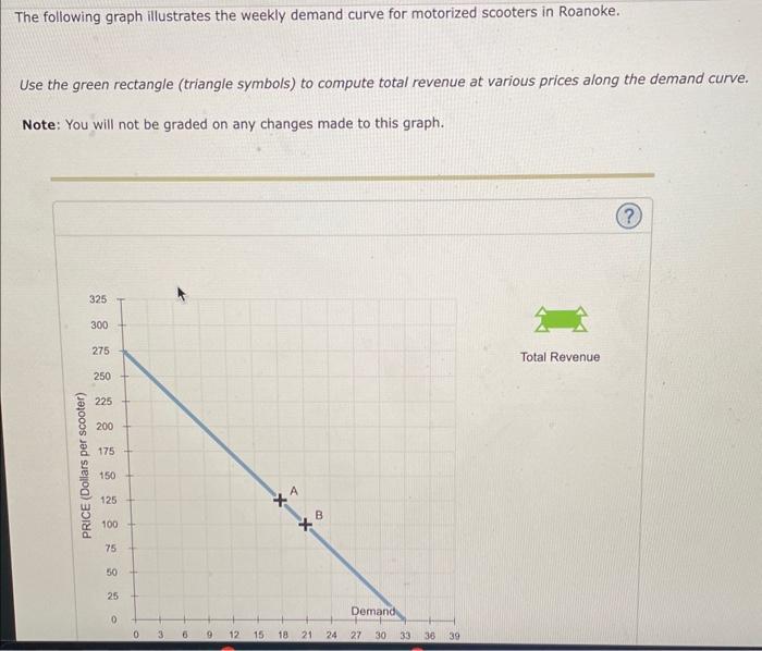
The following graph illustrates the weekly demand curve for motorized scooters in Roanoke. Use the green rectangle (triangle symbols) to compute total revenue at various prices along the demand curve. Note: You will not be graded on any changes made to this graph.
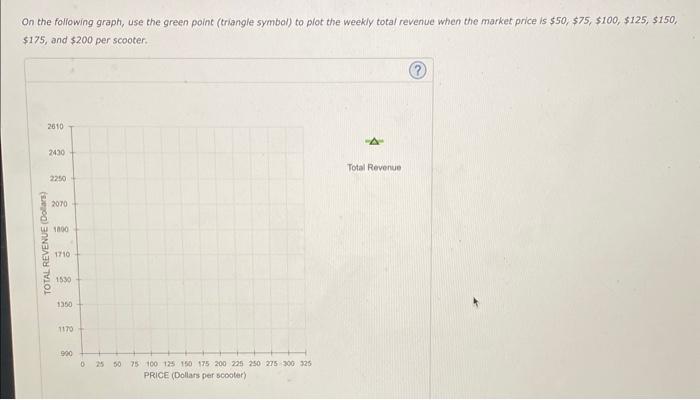
On the following graph, use the green point (triangle symbol) to plot the weekly total revenue when the market price is , , and per scooter.
According to the midpoint method, the price elasticity of demand between points A and B is approximately Suppose the price of scooters is currently per scooter, shown as point A on the initial graph. Because the demand between points A and B is , a -per-scooter decrease in price will lead to in total revenue per week. In general, in order for a price decrease to cause a decrease in total revenue, demand must be