Home /
Expert Answers /
Economics /
consider-the-market-for-hyperbaric-chambers-the-market-price-of-each-hyperbaric-chamber-is-220-000-pa242
(Solved): Consider the market for hyperbaric chambers. The market price of each hyperbaric chamber is $220,000 ...
Consider the market for hyperbaric chambers. The market price of each hyperbaric chamber is $220,000, and each consumer demands no more than one hyperbaric chamber.
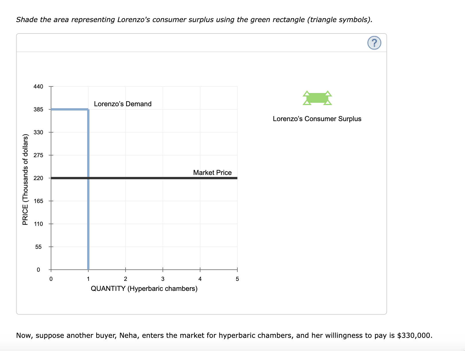
Suppose that Lorenzo is the only consumer in the hyperbaric chamber market. Their willingness to pay for a hyperbaric chamber is $385,000. Based on Lorenzo's willingness to pay, the following graph shows his demand curve for hyperbaric chambers.
Shade the area representing Lorenzo's consumer surplus using the green rectangle (triangle symbols). ( Lorenzo's Consumer Surplus Now, suppose another buyer, Neha, enters the market for hyperbaric chambers, and her willingness to pay is .
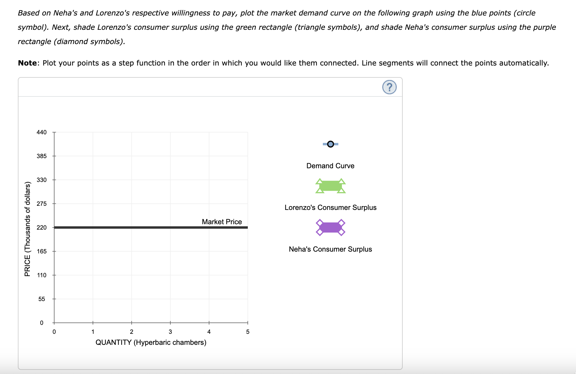
Based on Neha's and Lorenzo's respective willingness to pay, plot the market demand curve on the following graph using the blue points (circle symbol). Next, shade Lorenzo's consumer surplus using the green rectangle (triangle symbols), and shade Neha's consumer surplus using the purple rectangle (diamond symbols). Note: Plot your points as a step function in the order in which you would like them connected. Line segments will connect the points automatically.
Suppose Sam is willing to pay a total of for a hyperbaric chamber. True or False: Keeping his maximum willingness to pay for a hyperbaric chamber in mind, Sam will buy the hyperbaric chamber because it would be worth more to him than its market price of . True False


