Home /
Expert Answers /
Economics /
consider-the-graph-below-showing-the-marginal-damages-md-and-marginal-control-costs-mcc-associ-pa166
(Solved): Consider the graph below, showing the marginal damages (MD) and marginal control costs (MCC) associ ...
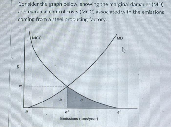
Consider the graph below, showing the marginal damages (MD) and marginal control costs (MCC) associated with the emissions coming from a steel producing factory. $ W MCC b Emissions (tons/year) MD 4
a. What does the area b represent? b. Explain carefully why e* is the most efficient level of emissions. c. Suppose the neighborhood around the steel factory suddenly becomes very popular and the population there increases by 10%. Which curve would change and in which direction? Would that increase or decrease the optimal level of pollution? Edit View Insert Format Tools Table 4
Expert Answer
a) the area b represents the total abatement costs of pollution. Area under MCC curve represent total abatement costs. Therefore, at equilibrium position, a