Expert Answer
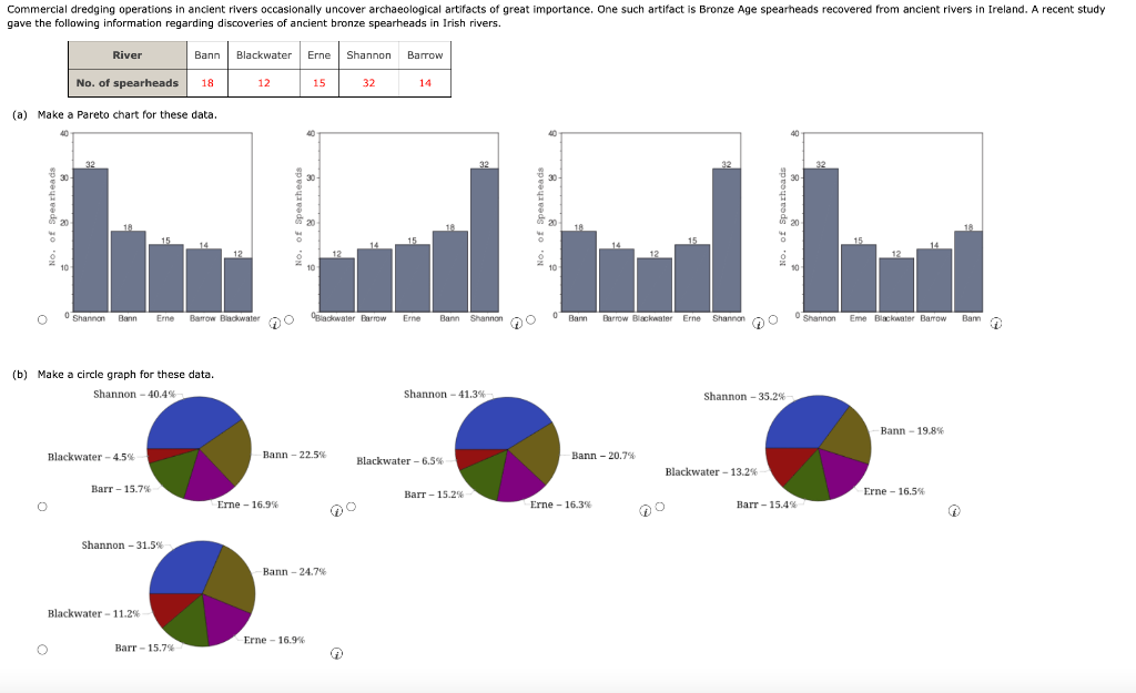
answers in explanation Explanation: (a) A pareto chart is similar to a bar graph but the bars to the left are the longest, and the bar to the right are the shortest, so length of bars decreases as you move to the right. Length of bar corresponds to f